



Choosing paint should be exciting. But stand in front of a wall of color cards for five minutes and it can quickly become overwhelming. A shade that looks perfect in the store may look too blue, too yellow, or much darker once it is on your wall.
This guide to the best paint colors for 2027 makes that decision easier. You will find the paint brands’ announced picks, what the colors look like, where they may work best, and how to test a shade before committing to an entire room. You will also find dependable whites and neutrals if you prefer a look that will last beyond one trend cycle.
The quick answer: Green is a prominent theme among the 2027 selections listed in this guide, joined by earthy browns, clay-inspired tones, rosy plum, and muted blues. You do not need to repaint your whole home to try a trend. Start with one room, a front door, a built-in, or a small accent area, and test the color in your own lighting first.
What a Color of the Year really means
There is no single official Color of the Year for paint. Each brand selects its own shade to reflect the styles, materials, and moods its color team expects to see in the coming year. The choices can be useful inspiration, but they are not rules you need to follow.
Think of these announcements as a shortlist of ideas. A color can be popular and still be wrong for a particular room. Your natural light, flooring, furniture, fixed finishes, and personal taste matter more than a trend forecast.
The selections below reflect the announcements tracked at the time this article was prepared. The list may change as additional brands publish their picks. For the latest details, check the linked brand announcements before choosing a color or ordering paint. Pantone and other color organizations may publish separate selections, and not every announced shade is an interior wall paint.
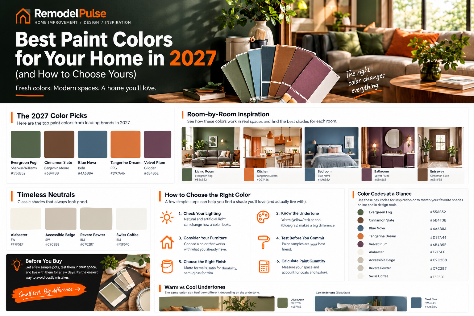
2027 paint colors at a glance
Use this table to compare the announced colors quickly. The descriptions explain the general look of each shade; the exact appearance will vary with lighting, sheen, and the surface you paint.
| Brand | 2027 selection | How it looks | A good place to try it |
|---|---|---|---|
| Benjamin Moore | Webster Green | A mid-tone gray-green that can work indoors or outdoors. | Living room, entry, front door, or built-ins. |
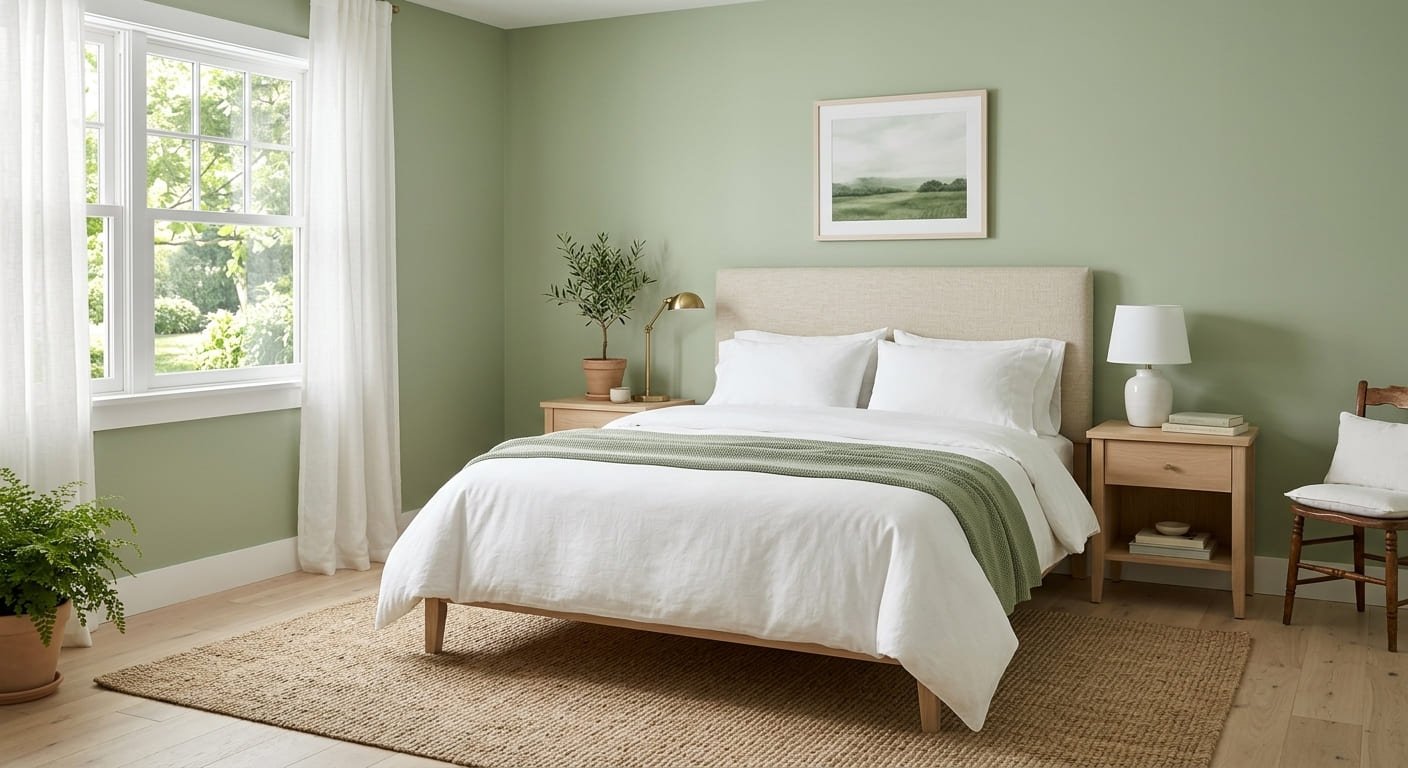
| Sherwin-Williams / HGTV Home | Celery | A light, fresh herbal green. | Bedroom, home office, or a room that needs a softer color. |
| Behr | Grounded | A mossy olive with brown undertones. | Dining room, cabinetry, or a feature wall. |
| Glidden | Artifact | A muted, smoky blue. | Bedroom, living room, or bathroom. |
| Valspar | Cottage Door | A steely blue softened with gray. | Bathroom, bedroom, or a quiet living space. |
| Dutch Boy | Deep Rooted | An earthy orange with a warm, grounded feel. | Dining room, accent wall, or a smaller decorative area. |
| Dunn-Edwards | French Press Coffee | A deep brown with purple undertones. | Accent wall, lower cabinets, or a room with good lighting. |
| C2 Paint | Pueblo | A rosy plum that adds depth and warmth. | Dining room, powder room, or a carefully chosen accent. |
| Graham & Brown | Rose Earth | A warm, clay-inspired neutral. Graham & Brown is known for wallcoverings, so check the brand’s product details before treating it as a standard wall-paint option. | Use as inspiration for a warm palette; confirm the available product and finish. |
You may also see Soulful Sage from Dulux, a soft gray-green selection associated with the UK and European market. Availability and product names vary by country, so check local listings before looking for it in a US paint store.
For the official color descriptions, see the Benjamin Moore 2027 color announcement and the Sherwin-Williams 2027 color announcement. The original announcement tracker at Young House Love can help you see which brands have announced their picks, but the manufacturers’ own pages should be used to confirm product details.
Three themes in the 2027 color selections
Although the colors are not identical, several selections share a similar direction. Here is what those themes mean in a real home and how to use them without making a room feel overdone.
1. Greens, from light and herbal to deep and earthy
Green appears repeatedly in the selections, ranging from Celery’s lighter herbal look to Webster Green and Behr’s deeper olive. These shades can connect a room with natural materials such as wood, linen, stone, and plants.
How to use green: Choose a lighter green if you want the room to feel airy. Try a mid-tone green for a stronger but still flexible wall color. Save a deep olive for a feature wall, lower cabinets, or a room with enough light and complementary finishes. If you are unsure, keep the trim and larger furnishings simple while you test the shade.
2. Warm earth tones: brown, clay, and orange
Grounded, French Press Coffee, Deep Rooted, and Rose Earth sit in the warmer part of the palette. These colors can look especially inviting beside wood, cream textiles, natural stone, and warm metal finishes.
How to use earth tones: If a full room in brown or orange feels like too much, use the shade on one wall, a small powder room, a built-in, or cabinetry. Warm colors can look stronger under yellow-toned evening bulbs, so check a sample at night as well as during the day.
3. Soft, smoky blues
Artifact and Cottage Door are muted blues with gray in the mix. Compared with a bright blue, a smoky blue usually feels quieter and can pair well with warm white, natural wood, brushed metal, and soft neutral fabrics.
How to use smoky blue: Try it in a bedroom or bathroom for a calm look, or use it in a living room if you want color without a very bold statement. Check the undertone beside your flooring and trim; a blue-gray can look noticeably cooler in a shaded room.
Does this mean cool gray and crisp white are out? No. Existing finishes do not suddenly become wrong because a new trend appears. The broader direction in these selections leans toward warmer, nature-inspired colors, but the best choice is the one that works with your home.
For more ideas that connect paint choices with broader design decisions, read our guide to home renovation trends for 2027.
How to choose the right paint color for your home
Before choosing a shade from a trend list, look at the parts of the room that are staying. This simple check can prevent an expensive mismatch.
- Start with fixed finishes. Look at your flooring, countertops, tile, brick, cabinets, and large furniture pieces. Pick a paint color that works with their undertones rather than competing with them.
- Consider the room’s natural light. A dark room may make a deep color feel heavier, while direct sunlight can make a pale color look washed out. Test the actual wall before deciding.
- Decide how much contrast you want. For a quiet look, choose colors close in depth and warmth. For more drama, pair a deeper wall color with lighter trim or furnishings.
- Choose the mood, not just the trend. Soft greens and smoky blues can feel restful; deep browns, plums, and clay tones can create a more intimate atmosphere. These are starting points, not guarantees.
- Think about the whole home. Open-plan spaces are easier to coordinate when nearby rooms share a related undertone or a small, consistent palette. The colors do not need to match exactly.
Best 2027 paint colors by room
The best paint color depends on how you use a room, how much natural light it receives, and how much cleaning the walls need. The suggestions below are starting points, not strict rules.
| Room | Colors to consider | Typical finish | Why it may work |
|---|---|---|---|
| Living room | Webster Green, Artifact, Cottage Door | Matte or eggshell | Muted mid-tones can add color without overpowering furniture and artwork. |
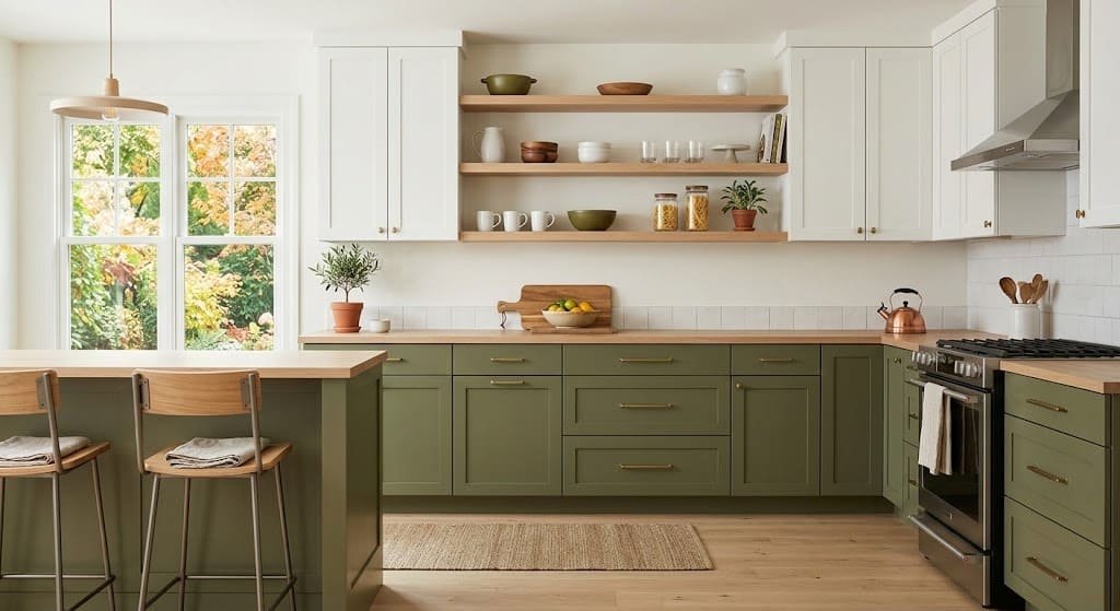
| Kitchen walls | Webster Green, Celery, a warm neutral | Eggshell or satin, depending on the product | Green can complement wood, stone, and many neutral finishes. |
| Kitchen cabinets | Webster Green or Grounded on lower cabinets; warm white on uppers | Durable cabinet enamel in the recommended finish | A two-tone palette adds contrast. Cabinet surfaces need a product designed for cabinetry and careful preparation. |
| Bedroom | Celery, Artifact, or a soft sage | Matte or eggshell | Muted shades can create a softer backdrop for bedding and natural textures. |
| Bathroom | Cottage Door, Artifact, Celery | Moisture-appropriate satin or another finish recommended by the manufacturer | Soft blue and green can feel fresh. Good ventilation and the right paint product matter as much as sheen. |
| Dining room | Deep Rooted, Pueblo, Grounded | Eggshell or another washable finish | Warm colors can create an intimate setting, especially with wood furniture and layered lighting. |
| Home office | Celery or Webster Green | Matte or eggshell | Green gives the room a clear color identity without requiring a bright accent. |
| Entry or front door | Webster Green or Grounded | Exterior-rated satin or semi-gloss for an exterior door | A smaller surface is a lower-commitment way to try a stronger color. Use a product made for the door’s material and exposure. |
A practical tip for kitchens and cabinets
Paint color is only one part of a kitchen palette. Compare your sample with the countertop, backsplash, flooring, cabinet material, and hardware in the same light. If you are painting existing cabinets, confirm that the surface can be prepared properly and use a suitable cabinet coating rather than ordinary wall paint.
If you are planning a bathroom update, our guide to small bathroom remodel ideas explains how color and lighting can work together in a compact space. If your project includes new cabinetry, see our comparison of RTA vs. assembled cabinets.
Timeless paint colors that work year after year
You do not have to follow a yearly trend to choose a good color. Whites, warm neutrals, and deep blues can be reliable choices when they suit the room’s fixed finishes. Even familiar colors can look different from one home to another, so test them before buying a full can.
| Paint color | Color code | General character | Consider it when… |
|---|---|---|---|
| Benjamin Moore Simply White | OC-117 | A soft white with warmth. | You want a clean look without an especially icy effect. |
| Sherwin-Williams Alabaster | SW 7008 | A creamy, warm white. | You prefer a softer white alongside wood and warm neutrals. |
| Sherwin-Williams Extra White | SW 7006 | A crisp, cooler white. | You want sharper contrast, provided it works with nearby finishes. |
| Sherwin-Williams Agreeable Gray | SW 7029 | A warm gray-beige neutral. | You want a flexible neutral that can bridge several materials. |
| Benjamin Moore Revere Pewter | HC-172 | A warm gray with a stone-like character. | You want more depth than a light white without choosing a strong color. |
| Benjamin Moore Hale Navy | HC-154 | A deep navy blue. | You want contrast on cabinetry, a feature wall, or a well-lit room. |
One practical approach is to keep large, expensive-to-change surfaces relatively versatile and introduce a trend color through a smaller feature: a front door, a bookcase, a powder room, or a set of cabinets. You can enjoy the new palette without committing every room to it.
How to test paint colors before buying
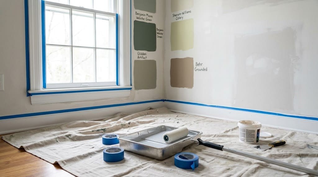
A small color chip is useful for narrowing down choices, but it is not enough to judge an entire wall. Follow these steps to see how a shade behaves in your actual space.
- Use a large sample. Buy sample paint or a suitable peel-and-stick sample. Aim for a sample large enough to judge from across the room; a tiny chip can hide undertones.
- Check more than one location. Test near a window and on a wall that receives less light. The same paint can look quite different in each place.
- View it at different times. Check in the morning, around midday, and at night with your usual lights switched on. North-facing rooms often receive cooler light, while south-facing rooms often receive warmer, stronger light, though local conditions vary.
- Compare it with permanent finishes. Hold the sample near flooring, countertops, tile, cabinets, trim, and furniture. A color that looks attractive alone may clash with one of these surfaces.
- Look for undertones. Whites can lean yellow, pink, or gray; grays can lean blue, green, or purple. Compare options side by side rather than judging each color in isolation.
- Give yourself time. Live with the samples for at least a couple of days. If possible, test the actual paint finish too, because sheen changes how light reflects off the surface.
- Check the finish and product label. Confirm that the paint is suitable for the surface and room. A wall paint, cabinet coating, and exterior paint are not interchangeable.
How much paint do you need?
One gallon of paint often covers around 350 to 400 square feet per coat, but actual coverage varies by product, surface texture, color change, and application method. Check the coverage printed on the can before calculating what to buy.
- Measure the width and height of each wall and calculate its area.
- Add the wall areas together, then subtract large doors and windows if you want a closer estimate.
- Multiply the paintable area by the number of coats you expect to apply. Two coats are common, especially when changing colors significantly.
- Divide that total by the product’s stated coverage per gallon, then round up to a practical purchase amount.
Buy enough paint to finish the job consistently, and keep a clearly labeled leftover container for future touch-ups. If possible, keep the product name, color formula, and sheen with your project notes.
Paint mistakes to avoid
- Skipping surface preparation. Dust, grease, peeling paint, and damaged drywall can lead to a poor finish. Clean the surface, repair defects, sand where appropriate, and prime when the surface or paint system calls for it.
- Choosing from a screen alone. Photos and displays can distort color. Use online images for inspiration, then judge real samples in the room.
- Choosing the wrong sheen or product. Flat finishes can be harder to clean in high-use areas, while glossy paint can emphasize surface flaws. Follow the paint maker’s recommendations for the room and substrate.
- Painting before other renovation work is finished. Electrical work, plumbing, drywall repairs, and other dusty tasks can damage a fresh coat. Plan paint toward the end of the messy work. Our guide to the best order to renovate a house explains the sequence.
- Ignoring possible lead paint. In the United States, homes built before 1978 may contain lead-based paint. Sanding or scraping it can create hazardous dust. Before disturbing old paint, review the EPA’s lead information and use qualified lead-safe professionals when required.
- Agreeing to vague painting work. If you hire a painter, get the preparation, repairs, primer, number of coats, paint brand, finish, and cleanup responsibilities in writing. Our guide to reading a contractor quote can help you review the scope.
- Buying paint before checking the color in your room. A color that looks perfect in a showroom may not suit your lighting or fixed finishes. Sample first, especially for dark or highly saturated shades.
Frequently asked questions
What are the best paint colors for 2027?
Among the selections listed in this guide, green is a prominent theme, with shades such as Webster Green, Celery, and Grounded. Muted blues, warm browns, clay tones, and rosy plum offer alternatives. The best color for your home depends on its lighting, finishes, and your preferences, not just the year’s trend list.
What is the Color of the Year for 2027?
There is no single official paint Color of the Year. Individual paint brands announce their own selections, and the announcements can happen at different times. Check the relevant manufacturer’s website for the current name, product details, and availability.
What is the best paint color for a living room in 2027?
A mid-tone green such as Webster Green or a muted blue such as Artifact or Cottage Door is a reasonable starting point if you want to try the year’s color direction. Pair the sample with your flooring and furniture, and test it in both daylight and evening light before committing.
Are gray walls out of style?
No. Gray remains an option if it works with your home. The current selections highlighted here include more warm and nature-inspired tones, but you do not need to repaint a room simply because trends change. You can introduce green, clay, or warm neutral accents instead.
Is dark paint a bad idea for a small room?
Not necessarily. A deep shade can make a small room feel cozy and intentional, but it can also feel more enclosed if the room has little light. Test a large sample, plan your lighting, and consider how the ceiling, trim, and furnishings will balance the color.
How often should interior walls be repainted?
It depends on traffic, surface condition, paint quality, and how the room is used. Low-traffic rooms may go several years before needing a full repaint, while kitchens, hallways, bathrooms, and children’s rooms may need cleaning or touch-ups sooner. Repaint when the finish is worn, stained, damaged, or no longer meets your needs rather than following a strict calendar.
Will a trendy paint color hurt resale value?
It can affect buyer appeal if a very bold color covers many rooms, but the result depends on the property and local market. If you plan to sell soon, versatile colors may appeal to a broader range of buyers. For a stronger shade, consider using it in a smaller area that is easy to repaint.
Should walls and trim be the same color?
Either approach can work. Contrasting trim creates a more defined outline, while walls and trim in the same color can make a room feel more continuous. Test the combination with your flooring and natural light, and remember that the finish can differ even when the color is the same.
Final thoughts: choose a color that works in your home
Use the 2027 paint color selections as inspiration, not a rulebook. A shade that looks beautiful in a brand’s photo may behave differently in your room, and the trendiest color is not automatically the best one for your furniture, lighting, or taste.
Choose two or three candidates, test large samples, and view them at different times of day. Compare them with the finishes you are keeping, then make the decision after you have seen the colors in context. That small amount of preparation is much easier than repainting an entire room.

Keep planning your project
Explore more practical, plain-English guides from the RemodelPulse team on renovation costs, permits, design decisions, and hiring contractors.